
Saturday, 30 March 2013
Which color symbolize passion and danger ?
Which color are associated with joy ?

Yellow and orange are the colors which can associate with joy because it represents enthusiasm, fascination, happiness, creativity, determination, attraction, success, encouragement and stimulation. It arouses cheerfulness as well generates energy.
Which color symbolize freshness ?
 Yellow shows brightness and represent sun. It is a color of light and life. It represents wealth, happiness, FRESHNESS, brightness, fulfilment, richness and spirituality. Green is regarded as a symbol of freshness since the greenery of nature is rather refreshing.
 Which is the color cleanliness
.jpg) White is the color of cleanliness. It is associated light, goodness, innocence and purity. It is considered to be the color of perfection. White means safety, purity and cleanliness. In heraldry, white depicts faith and purity where as in advertising, white is associated coolness and cleanliness because its the color of the snow. Angel are usually imagined wearing white clothes.
White is the color of cleanliness. It is associated light, goodness, innocence and purity. It is considered to be the color of perfection. White means safety, purity and cleanliness. In heraldry, white depicts faith and purity where as in advertising, white is associated coolness and cleanliness because its the color of the snow. Angel are usually imagined wearing white clothes. Which color symbolizes royalty?
.jpg)
The colors which are being used in royalty and kings are Red , Bright blue, and Purple ( and of course gold ) . This is because those colors are hard to get and thus expensive, so paints and clothes in these colors could only be afforded by rich people, thus making them royal.
What color is associated with stability ?

Stable color is a color that keeps the same hue though it may loose saturation down to a dead grey as it is viewed in indirect vision. (yellow, blue, bluish red or green ) .
What can be said in general about cool colors
 That phrase used to describe any color that is calm or any in nature. Cool colors are made with blue , green, purple and some of these combination of colors. Cool colors might make you think of cool and peaceful things, like winter skies and still ponds. Cool colors are not overpowering and tend to recede in space .
  |
| ( HUMAN.COM CLASS WORK by ME - Cool colors ) |
What can be said in general about warm colors ?
 Warm colors are made with orange, red and yellow and combination of all of them. As the name indicates, they tend to make you think of sunlight and heat. Warm color looks as though they come closer or advance ( as do dark colors) which is why they often used to make wide room look cozier.
 Friday, 29 March 2013
Definition of neutral
Neutral is aligned with supporting, or favoring either side in war, dispute or contest. It beloging to neither side in a controversy (on neutral ground). In a simpler way, it belongs to neither kind or not one thing.

Definition of shade
Shade is the light diminished in intensity as a result of interception of the rays, partial darkness. Any of various devices used to reduce or screen light or heat. To change or vary by slight degrees.

Definition of tint
Tint is a shade of a color especially a pale or delicate variation. Its a slight coloration or a tinge.
.jpg)
Definition of analogous colors
Analogous colors are group of colors that are adjacent to each other on the color wheel, with one bein the dorminant color, which tends to be the primary or secondry color and two on either side complimenting , which tend to be tertiary. Red, yellow and orange are examples of analogous colors.

Definition of complementary colors
Complementary colors are pairs of colors that are of opposite hue in some color model. The exact hue complementary to a given hue depends on the model in question and perceptually uniform, additive, and subjective color models, for example, having different complements for any given colors.

Definition of tertiary color
A color resulting from the mixture of two secondary colors. A color resulting from the equal mixture of primary color with either of the secondary colors adjacent to it on a color wheel.

Definition of secondary color
A color produced by mixing two additive primary colors in equal proportions. The secondary colors are cyan (a mixture of blue and green), magenta (a mixture of blue and red), and yellow (a mixture of green and red). Each secondary color is also thecomplementary color (or complement) of the primary color whose wavelength it does not contain. Thus cyan is the complement of red, magenta is the complement of green, and yellow is the complement of blue

Definition of Saturation
Saturation is the act or process being saturating or the state of being saturated. It is a attribute of color the enables the observer to judges its proportion of pure chromatic colors. Its the degree of chroma or purity of a color or can be describe as the degree of freedom from admixture of white. Saturation measures the degree to which a color differs from a gray of the same darkness or lightness.

Definition of value
Value in arts means a gradation of tone from light to dark or of color luminosity. This is the relation of one of these elements to another or to the whole picture.

Definition of Hue
Hue is the property of colors by which they can be perceived as ranging from red trough yellow, green and blue as determined by the dominant wavelength of the light. Hue can also be define as a particular gradation of color (all the hues of the rainbow) !
Example :- 
Sunday, 10 March 2013
What is Design ?
Design is a convention or a plan for a system or an object ! Besides that, design can be included as a roadmap or a strategic approach for someone to achieve a unique exception !
What is Principle of Design ?
The principles are concepts used to organize or arrange the structural elements of design. In which these principles are applied affects the expressive contents or message of the work.
The principles are :
1) Balance
2) Proportion
3) Rhythm
4) Emphasis
5) Unity
Balance- Balance is the concept of visual equilibrium, and relates to our physical sense of balance. It is a reconciliation of opposing forces in a composition that results in visual stability. Most successful compositions achieve balance in one of two ways: symmetrically or asymmetrically. Balance in a three dimensional object is easy to understand; if the balance isn't achieved, the object tips over. To understand balance in a two dimensional composition, we must use our imaginations to carry this three dimensional analogy forward to the flat surface.
Proportion-
Proportion refers to the relative size and scale of the various elements in a design. The issue is the relationship between objects, or parts, of a whole. This means that it is necessary to discuss proportion in terms of the context or standard used to determine proportions.
Rhythm-
Rhythm can be described as timed movement through space; an easy, connected path along which the eye follows a regular arrangement of motifs. The presence of rhythm creates predictability and order in a composition. Visual rhythm may be best understood by relating it to rhythm in sound.Rhythm depends largely upon the elements of pattern and movement to achieve its effects. The parallels between rhythm in sound/ music are very exact to the idea of rhythm in a visual composition. The difference is that the timed "beat" is sensed by the eyes rather than the ears. Visual rhythm can be created in a number of ways :-
a) Linear rhythm
b) Alternation
c) Repetition
d) Gradation
Emphasis-
Emphasis is also referred to as point of focus, or interruption. It marks the locations in a composition which most strongly draw the viewer's attention. Usually there is a primary, or main, point of emphasis, with perhaps secondary emphases in other parts of the composition. The emphasis is usually an interruption in the fundamental pattern or movement of the viewer's eye through the composition, or a break in the rhythm.
The artist or designer uses emphasis to call attention to something, or to vary the composition in order to hold the viewers interest by providing visual "surprises." Emphasis can be achieved in a number of ways :-
a) Contrast ----use of neutral background / color / texture / shape / size / scale
b) Repetition
c) Placement in a strategic position
Unity-
Unity is the underlying principle that summarizes all of the principles and elements of design. It refers to the coherence of the whole, the sense that all of the parts are working together to achieve a common result; a harmony of all the parts.
CRAZY HAT WEEK

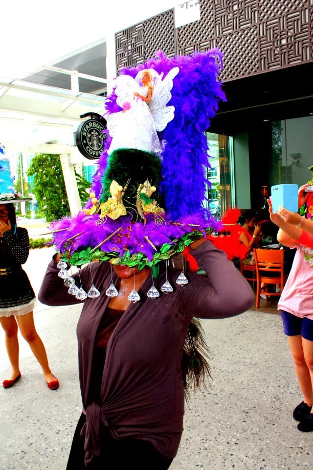

Subject- Human com !
My very own design JUST in 2 days ~
We were suppose to walk around the whole campus with our hats around because the marks will be given according to the most favorable by the lecturers and students from our campus. And I got third place among 27 students.
Class work

What are art movement ? Art movement is the composite heading that are given to art works which share the similar satisfying ideals, region, style or technical approach. They are basically the 19th/20th century build up when there was a greater difference of style that at any other extant of time in the art history. Besides that, there are no permanent rules that determine what comprise an art movement whereas it may adhere to authoritarian guiding principles. Least but not last, art movement is simply an ancient convenience for classification of artists within a distinguishing context. There are many kinds of art movement which has been recognized today. The one that inspire me are Expressionism and Toyism.
Expressionism is a kind of innovation or novelty movement, initially in poetry and painting. What is put together in this formation of art are emotion, mood and ideas which is then being expressed in a piece of paper.
Toyism is a collaborative movement that grows in prominence in the Netherlands. In Toyism,the artist takes for granted fictional names to counter the art by forming an anonymous collective as well using false names and symbolic images which is included in their art work. The formation of this painting involves imagination, innovation, chronological, fantasy, transparency, resembling a dream, clarity drown from reality, a world full of color and in fluency. Toyism is an art that can really provoke personal narrative of the viewer's sight and perspective or better off said, ' there is a story behind every piece of art.'
POD assignment (4/2/13)
This assignment were given to us to understand the proportion and to learn how to use the 'The Rule of Third' techniques. Somehow, I manage to capture what Ive been thought.
Subscribe to:
Posts (Atom)